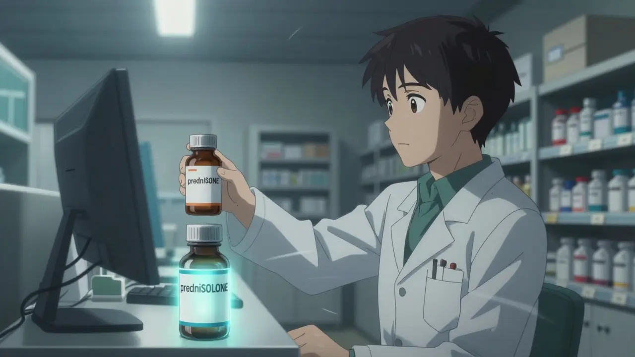
Every year, thousands of medication errors happen because two drug names look or sound too similar. A patient meant to get prednisone ends up with prednisolone. Someone asks for hydrocodone, but the pharmacist pulls hydromorphone. These aren’t just typos-they’re life-threatening mistakes. And the fix isn’t high-tech. It’s simple: tall-man lettering.
Tall-man lettering uses capital letters to highlight the parts of drug names that differ. Instead of writing "prednisone" and "prednisolone" in all lowercase, you write predniSONE and predniSOLONE. The capitalized "SONE" and "SOLONE" jump out visually. That tiny change cuts down confusion in seconds. It’s not magic. It’s design. And it’s been used in hospitals, pharmacies, and clinics for over two decades.
Why Tall-Man Lettering Works
Our brains are wired to recognize patterns. When two drug names are almost identical, our eyes glaze over. We skim. We assume. That’s how errors happen. In a busy pharmacy, a pharmacist might scan 50 drug names in five minutes. If they see "diltiazem" and "diltiazem" side by side (one’s actually "diltiazem", the other’s "diltiazem"-wait, no, that’s not right), they might pick the wrong one.
Tall-man lettering forces the brain to pause. It creates a visual anchor. A 2004 eye-tracking study by the Institute for Safe Medication Practices (ISMP) showed that when pharmacists saw drug names in tall-man format, they spent 35% more time looking at the distinguishing letters. That extra time is what stops mistakes before they start.
It’s not about spelling. It’s about sight. A nurse in an emergency room doesn’t have time to read a full drug name. They need to grab the right one fast. Tall-man lettering turns a risky guess into a clear choice.
How It’s Done: The Rules
There’s no single global standard, but most systems follow guidelines from the U.S. Food and Drug Administration (FDA) and ISMP. Both organizations publish lists of drug pairs that need tall-man formatting. As of 2023, the FDA lists 72 pairs. ISMP tracks 252. Australia uses 192.
The rule is simple: Capitalize the letters that are different. Start from the left and go until you hit the first mismatch.
Here are real examples:
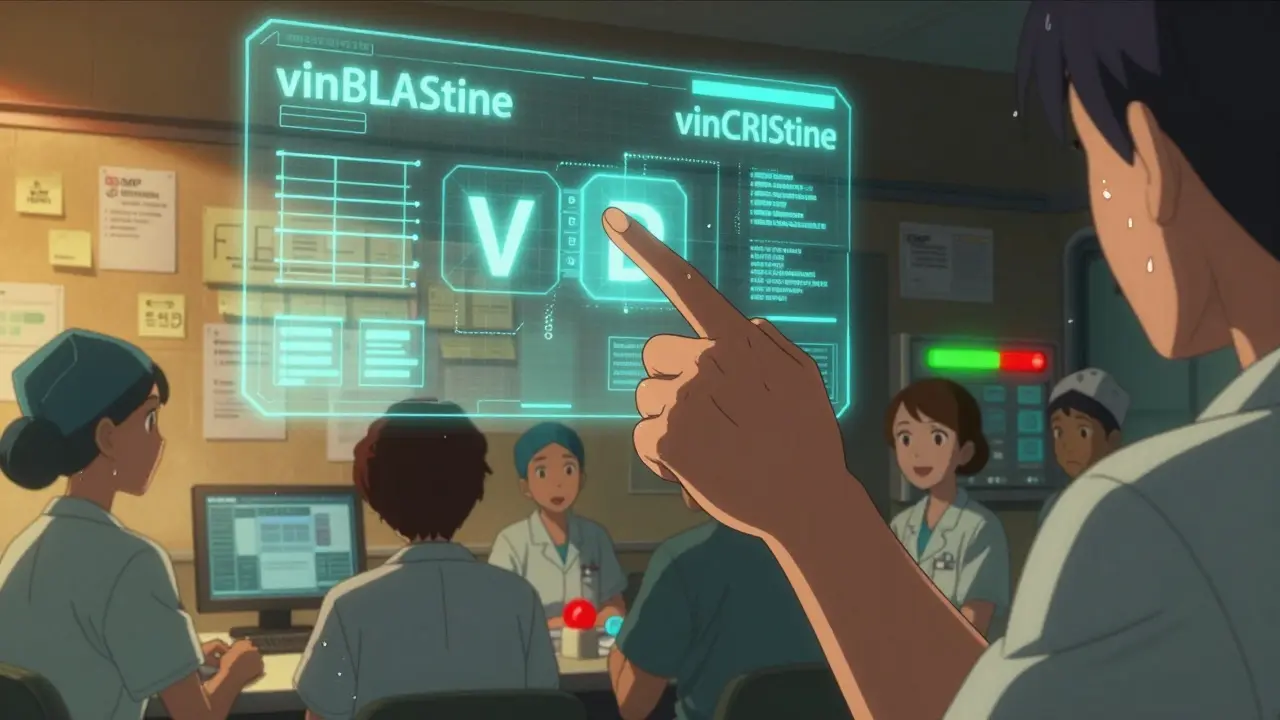
- vinBLAStine vs. vinCRIStine - The "B" and "C" are different, so they’re capitalized.
- CISplatin vs. CARBOplatin - "IS" vs. "ARBO" - so those parts are uppercase.
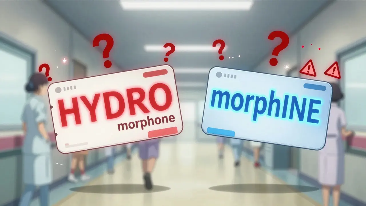
- HYDROmorphone vs. morphINE - "HYDRO" and "INE" are the key differences.
- PARoxetine vs. FLUoxetine - "PAR" and "FLU" are the distinguishing bits.
Notice something? The capitalization doesn’t always match the brand name. That’s okay. The goal isn’t to follow marketing. It’s to prevent errors.
Some systems capitalize more than others. ISMP recommends HYDROcodone vs. oxyCODONE. The FDA uses hydroCODONE vs. oxycodone. That inconsistency? It’s a problem. A 2022 survey found 63% of pharmacists said conflicting capitalization between systems created more confusion than it solved.
Where Tall-Man Lettering Is Used
This isn’t just a label on a bottle. It’s embedded everywhere a drug name appears:
- Electronic Health Records (EHRs)
- Pharmacy dispensing systems
- Automated dispensing cabinets (like Pyxis machines)
- Prescription labels
- Drug packaging
- Medication administration records
In a hospital, a nurse checks a patient’s medication on a screen. If "LORazepam" and "ALPRAZolam" are both in lowercase, they look nearly identical. But with tall-man lettering-LORazepam and ALPRAZolam-the differences pop. One has "LOR" capitalized, the other "ALPRAZ". No more guessing.
Even in community pharmacies, tall-man lettering shows up on printed labels. A patient might not notice it, but the pharmacist does. And that’s what matters.
What the Evidence Shows
Is it effective? Yes-but not perfectly.
A 2016 study in Pediatrics claimed tall-man lettering didn’t reduce errors in children’s hospitals. But that study had a big flaw: it didn’t check if hospitals actually implemented it correctly. Many just changed one system and left others untouched.
Real-world results tell a different story. A 2022 study in Pharmacology Research & Perspectives followed a hospital that applied tall-man lettering across 13 systems. They modified 210 drug names. In six months, overridden safety alerts for look-alike drugs dropped by 42%.
Another survey by Wolters Kluwer found 78% of pharmacists believe tall-man lettering improves safety. Nurses say it cuts down on double-checking. One nurse practitioner wrote: "The capitalized 'SONE' in predniSONE tells me it’s not predniSOLONE. I don’t have to pause anymore."
But here’s the catch: it only works if it’s consistent. If your EHR says PARoxetine and your automated cabinet says paroxetine, you’re back to square one.
Implementation: What It Takes
Setting up tall-man lettering isn’t plug-and-play. It takes planning.
Here’s how a typical hospital does it:
- Form a team: pharmacists, IT staff, nurses, and safety officers.
- Choose which drug names to change, using ISMP or FDA lists.
- Update every system: EHR, pharmacy software, dispensing machines.
- Train staff. Yes, even if it seems obvious, people need to know why it matters.
- Monitor results. Track how many safety alerts are triggered after the change.
For a 500-bed hospital, the whole process takes about 16 weeks. That’s not fast. But the cost? Around $1,200 per system in Australia. In the U.S., it’s often built into the EHR vendor’s software-no extra charge.
The biggest hurdle? Legacy systems. 68% of hospitals in a 2022 survey said their old software didn’t support tall-man formatting well. Upgrading isn’t always easy. But skipping it? Riskier.
Limitations and Criticisms
Tall-man lettering isn’t a cure-all.
It doesn’t help with drugs that are nearly identical from the start. For example, metoprolol and methyldopa. The first two letters are the same. The difference is deeper in the word. Tall-man lettering can’t fix that.
Some experts argue it gives a false sense of security. Dr. Robert Wachter wrote in NEJM Catalyst that forcing functions-like making the system require a second confirmation before dispensing a high-risk drug-are more reliable. He’s right. But tall-man lettering doesn’t replace those tools. It supports them.
The Cochrane Collaboration reviewed the evidence in 2022 and rated the certainty of proof as "moderate" for reducing selection errors, but "low" for preventing actual patient harm. That means: it helps you pick the right drug, but we don’t yet have solid proof it stops deaths.
Still, it’s cheap. Easy to install. Doesn’t require new hardware. And it works.
The Future: What’s Next?
In January 2023, the FDA and ISMP announced they’re working together to create one unified list of tall-man lettering rules. That’s huge. No more "Cerner says this, Epic says that".
Some hospitals are testing AI that adjusts capitalization based on real-time error data. Epic Systems piloted this in 15 hospitals in 2023. The AI noticed which drug pairs kept causing mix-ups and adjusted the capitalization to make the differences even clearer. Results? 29% fewer errors than standard tall-man.
Will voice recognition or barcode scanning replace it? Maybe someday. But right now, even the most advanced systems still show drug names on screens. And humans still read them. Tall-man lettering is the simplest way to make sure they read the right one.
The Institute for Safe Medication Practices says it best: "Tall-man lettering is not a panacea-but it’s one essential layer in our defense-in-depth approach to medication safety."
What You Can Do
If you work in healthcare:
- Check your EHR or pharmacy system. Are look-alike drugs formatted with tall-man lettering?
- If not, ask your IT or pharmacy team to implement it using the ISMP or FDA list.
- Make sure all systems match. A mismatch between your computer and your automated cabinet defeats the purpose.
- Train your team. Don’t assume they know why "FLUoxetine" is capitalized.
If you’re a patient:
- Ask your pharmacist: "Is this the right drug? I’ve heard some names look alike."
- Check the label. Does it use tall-man lettering? If not, ask why.
- Speak up. Your vigilance saves lives.
Medication errors aren’t inevitable. They’re preventable. And sometimes, all it takes is a few uppercase letters.
What is tall-man lettering?
Tall-man lettering is a typographic technique that uses selective capitalization in drug names to highlight differences between look-alike, sound-alike medications. For example, writing "predniSONE" and "predniSOLONE" helps distinguish between prednisone and prednisolone. It’s designed to reduce medication errors caused by visual confusion.
Which organizations recommend tall-man lettering?
The U.S. Food and Drug Administration (FDA) and the Institute for Safe Medication Practices (ISMP) are the two main organizations that recommend and maintain lists of drug names requiring tall-man lettering. The FDA has a list of 72 drug pairs, while ISMP tracks 252. Australia and New Zealand also use similar systems.
Does tall-man lettering actually reduce errors?
Yes, when implemented consistently. Studies show up to a 42% reduction in safety alerts for look-alike drugs after full system implementation. Eye-tracking research found a 35% improvement in visual discrimination. However, effectiveness drops if only one system in a hospital uses it while others don’t.
Why do different systems use different capitalization?
Different organizations-like the FDA and ISMP-have slightly different guidelines. Some vendors implement them inconsistently. This creates confusion: one system might show "PARoxetine", while another shows "paroxetine". A joint FDA-ISMP initiative launched in 2023 aims to unify these standards by 2024.
Can tall-man lettering fix all drug name mix-ups?
No. It’s most effective when the difference between two drug names occurs in the middle or end of the word. It doesn’t help much when the first letters are identical, like "metoprolol" and "methyldopa". It’s one layer of safety-best used alongside barcode scanning, double-checks, and electronic alerts.
APRIL HARRINGTON
March 10, 2026 AT 05:24Peter Kovac
March 11, 2026 AT 12:19Leon Hallal
March 13, 2026 AT 06:27Judith Manzano
March 13, 2026 AT 17:18rafeq khlo
March 14, 2026 AT 22:06Janelle Pearl
March 15, 2026 AT 06:09Ray Foret Jr.
March 15, 2026 AT 11:05Samantha Fierro
March 16, 2026 AT 09:23Robert Bliss
March 17, 2026 AT 08:19Morgan Dodgen
March 18, 2026 AT 20:39Tom Sanders
March 19, 2026 AT 08:25